8 Years of LLM Deployment Visualized + Methodology

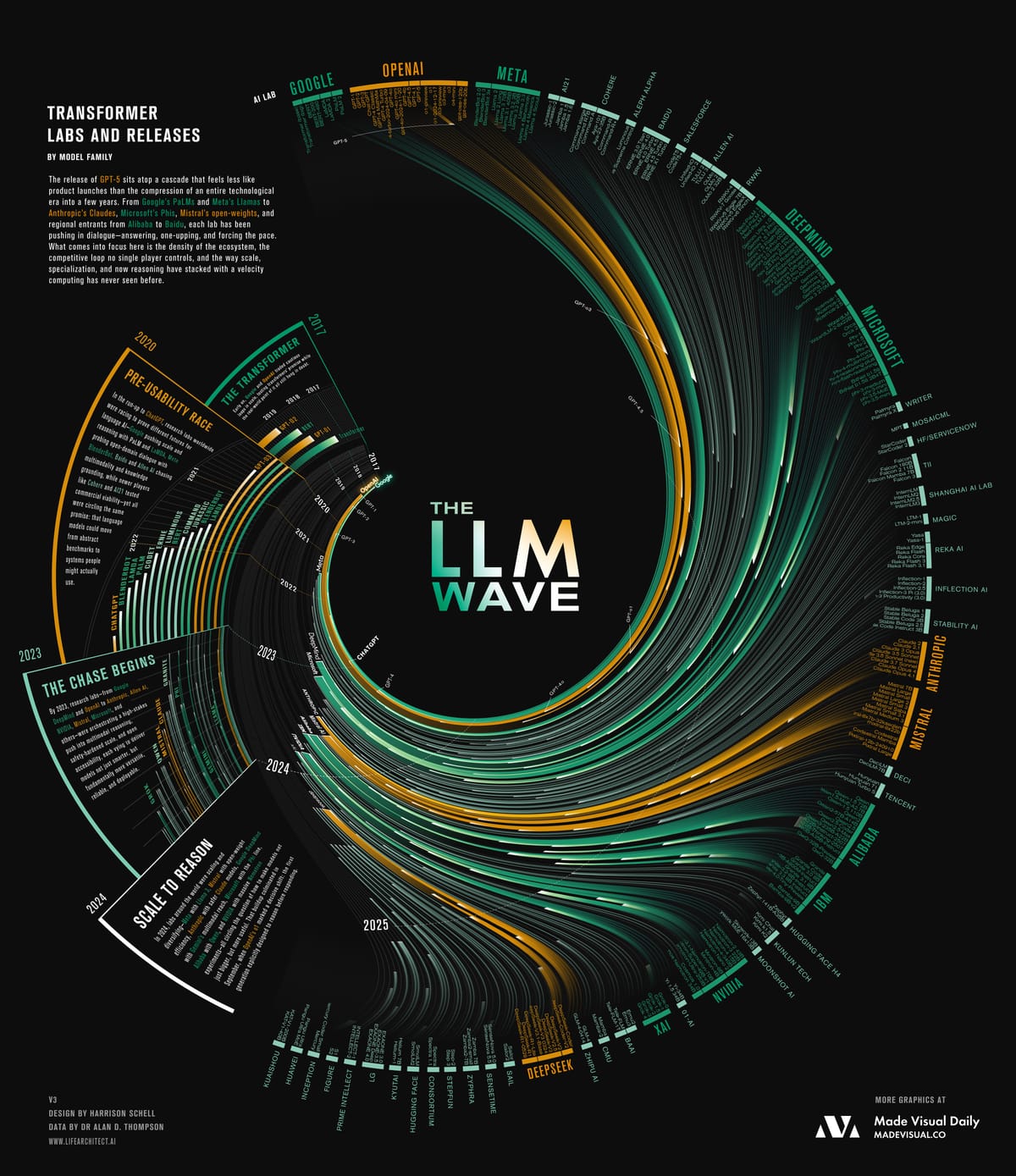
What becomes clear when the past eight years are collapsed into a single view is not just the pace of releases, but the transformation of AI into a self-sustaining system. Competition, capital, and curiosity have created a cycle where each launch accelerates the next, collapsing the distance between breakthrough and deployment. The effect is less a story of individual models than of a whole industry spiraling outward with unprecedented velocity.
Takeaways
- The center of gravity has shifted from a handful of labs to a crowded ecosystem. OpenAI and Google may have set the tempo, but the sheer diversity of entrants—from boutique startups to state-backed giants—shows how porous the frontier has become.
- Specialization now matters as much as scale. Where early models competed on raw size, newer entrants stake claims on safety, coding, multimodality, or efficiency—signaling a field that is branching rather than converging.
- No single actor controls the feedback loop. Releases are now both competitive and collaborative, each model triggering benchmarks, fine-tuning, and rival launches elsewhere; the system itself is what drives acceleration.
Data & Caveats
- Dates reflect public releases, not internal prototypes—meaning some breakthroughs appeared later on this timeline than they were first achieved.
- Model naming conventions vary across labs (e.g., families like Phi, Claude, Llama), and many intermediate versions or private deployments are not shown.
- The visualization emphasizes model announcements; adoption and real-world impact often lagged months behind.
- Several labs publish openly (e.g., Hugging Face, Mistral) while others release selectively, creating uneven visibility into activity.
Methodology Behind The Wave of LLMs
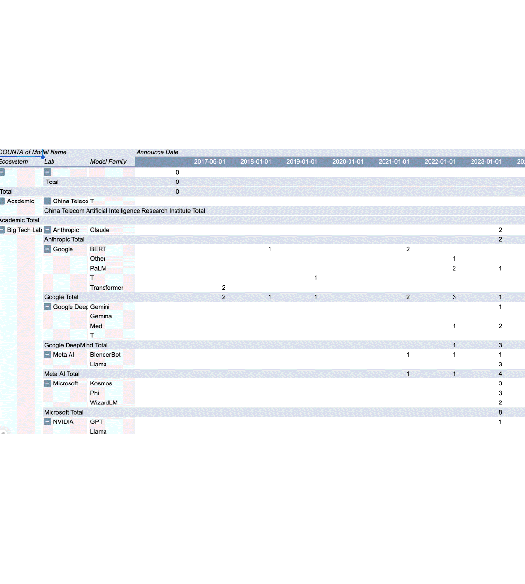
The idea for this piece started simply: I wanted to make a visual that tracked the evolution of large language models. With the much-anticipated release of ChatGPT-5, it felt like the right moment to step back and see not just this release in isolation, but the entire lineage it belongs to. The problem is, if you’ve been following the space, you know how messy it can feel. OpenAI’s naming conventions can be confusing, and each major lab—Anthropic, Google DeepMind, Mistral, DeepSeek—has its own rhythm of releases. If you’ve been paying attention, you may carry this loose timeline in your head (“Gemini came out around then, Claude 2 dropped here, DeepSeek had a moment there…”), but in reality the pace is so fast that each headline fades almost instantly into the next.
To ground myself, I started with a dataset curated by Dr. Alan Thompson, who has been meticulously documenting model releases since the very beginning. His work goes further back than most, pulling in early AI systems that paved the way for today’s LLMs. I used his timeline as my base, then began experimenting with how to represent it visually.
My goals were clear:
- Show the ecosystem of players.
- Make the evolution of model families legible.
- Emphasize the explosion—both in labs and in models themselves.
The challenge was in the filtering. I wanted to avoid a cluttered mess of one-off experiments, so I narrowed the dataset to model families that had more than one release. In other words, if a lab built a single model and never followed up, I removed it. This left me with the “serious players,” and suddenly the dataset felt sharper, more meaningful.
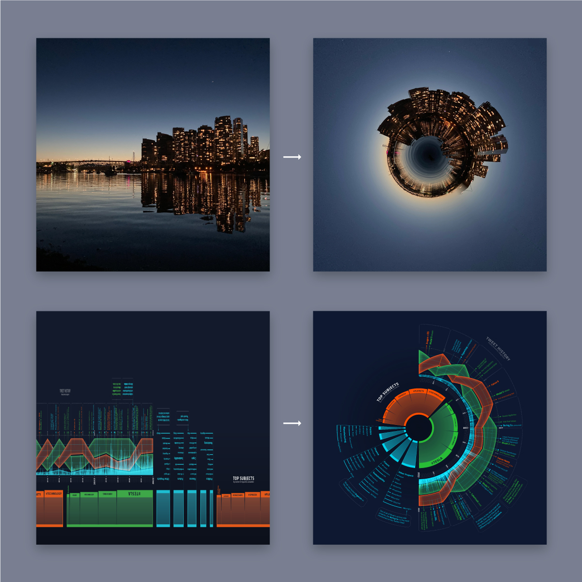
From there came the design problem: how to show both the grouping (models belonging to a lab) and the sequence (order of release). I leaned on a branching evolutionary tree diagram generated with Python, which gave me a raw vector structure. That became the backbone. But the form you see today—the flowing, wave-like geometry—came from layering on a warping technique I had previously developed. It’s based on the “tiny world” Photoshop effect, but applied in a radial warp before the final circular distortion. It’s finicky to work with, but the control it gives me is precise and allows me to place labels with intention.
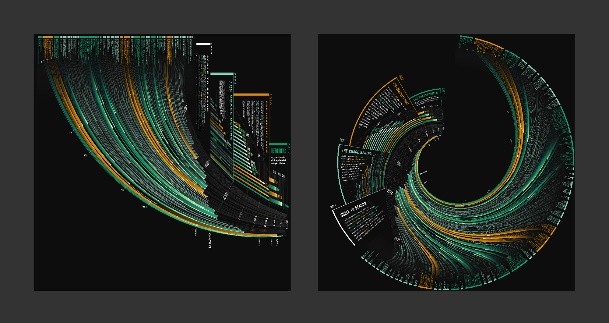
When I saw the first warped output, I knew I was onto something. It had the right balance of chaos and structure, of legibility and spectacle. From there, it was a process of refining: cleaning up the shapes, adjusting proportions, and making the hierarchy clear.
Does it succeed in being universally approachable? Probably not. If you don’t already know what an LLM is, or the names of the main labs, you won’t immediately decode the signifiers. But that wasn’t the only goal. I wanted the piece to feel like the phenomenon itself: overwhelming, futuristic, brain-bending. The final graphic sits somewhere between data visualization and art—it’s less about quick consumption and more about evoking the spectacle of this moment in AI history.
Did you like this extended article? Let me know!
-Harrison